Table of Contents
ToggleCherry wood bedroom furniture brings warmth and sophistication to any bedroom, but choosing the right paint colors and wall finishes to complement it can feel daunting. The rich, reddish-brown tones of cherry wood demand thoughtful color pairing, pick something too cold, and the furniture looks harsh: go too light, and it disappears into the walls. The good news? Cherry wood is forgiving when you understand a few core principles. Whether you’re designing a cozy retreat or a bold statement room, the right wall color will make your cherry wood pieces the focal point they deserve to be while creating a cohesive, finished look that ties the whole space together.
Key Takeaways
- Warm neutral tones like soft taupes and light caramels provide the safest, most sophisticated foundation for cherry wood bedroom furniture without competing for attention.
- Cool grays with blue or purple undertones create striking modern contrast with cherry wood, but require testing samples in actual lighting conditions to avoid mismatched color reads.
- Deep jewel tones—emerald, sapphire, burgundy, and plum—pair beautifully with cherry wood for a luxurious effect, though accent walls work better than painting all four walls to prevent the space from feeling oppressive.
- Soft blues and greens offer calming, serene backdrops that respect cherry wood’s presence while providing peaceful contrast without requiring complex layering or strategic accessorizing.
- Lighter colors like soft creams and beiges brighten bedrooms with less natural light, but demand washable finishes to manage dust and fingerprints effectively.
- Testing wall paint samples in both afternoon and evening light is essential, as colors shift dramatically depending on the time of day and adjacent surfaces.
Warm Neutral Tones: The Safest Foundation
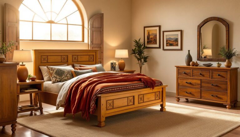
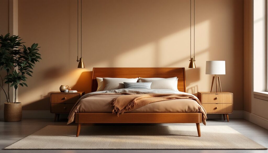
If you’re hesitant about bold colors, warm neutral wall tones are your go-to choice. Think soft taupes, warm grays, and light caramels, these shades sit naturally alongside cherry wood without competing for attention. A warm taupe (not the cool, grayish kind) will echo the depth of the wood while keeping the room open and approachable. Light caramel walls pair beautifully with cherry wood because they share similar undertones, creating a monochromatic, restful effect.
The magic of warm neutrals is that they’re nearly impossible to get wrong. They read as sophisticated rather than boring, especially when paired with natural linens and wood elements. Paint two coats of a quality interior finish, most warm neutrals cover evenly in this range. If you’re worried about a flat appearance, layer in texture through bedding, area rugs, or a subtle wallpaper accent wall behind the headboard.
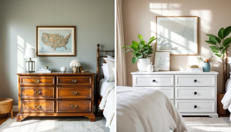
Soft Creams and Beiges: Light and Airy Bedrooms
For a bright, inviting bedroom, soft cream and beige walls create an airy backdrop that lets cherry wood furniture shine without darkening the space. These ultra-light neutrals work especially well if your bedroom doesn’t get abundant natural light, they reflect what light you do have and prevent the room from feeling cave-like. The key is choosing a cream or beige with warm undertones rather than cold or yellow-heavy versions, which can clash with cherry’s reddish hues.
Consider a cream with a slight peachy undertone (sometimes labeled “warm cream” or “light ivory”) for the best compatibility. Bedrooms styled with soft cream walls often benefit from layered textures: a darker rug, patterned pillows, or wooden accessories break up the lightness. This palette is also forgiving for resale, most buyers respond positively to a light, clean bedroom backdrop. One practical note: lighter colors show dust and fingerprints more readily, so use a washable satin or semi-gloss finish rather than flat paint if you have kids or pets.
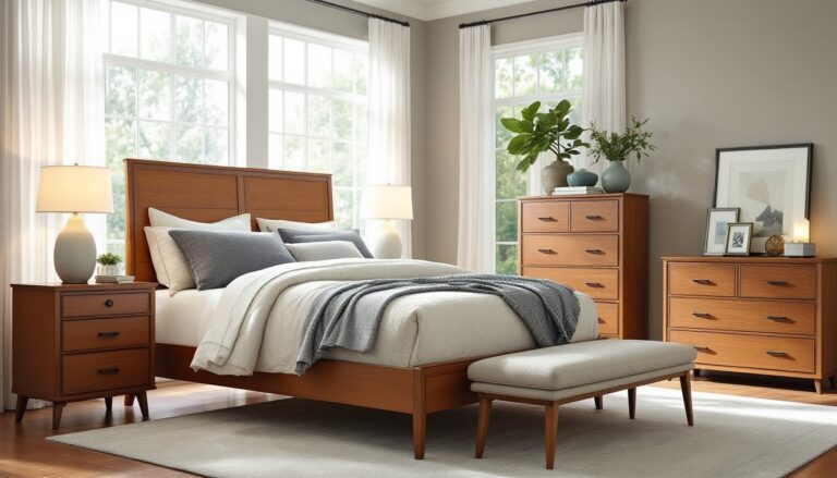
Cool Gray: Modern Elegance with Cherry Wood
Gray has become a bedroom staple, and for good reason. A well-chosen cool gray (with slight blue or purple undertones) creates a striking contrast with cherry wood while maintaining visual harmony. The contrast here is intentional, it’s not jarring because gray sits opposite cherry on the color wheel in a way that feels balanced rather than clashing. Think of gray as the modern counterpart to traditional cherry wood styling.
The critical step is testing your gray sample on the actual wall where cherry furniture will sit. Gray paint samples can read dramatically different depending on lighting and adjacent colors. A medium-tone gray (roughly 50% gray value) usually works better than very light or very dark versions: it anchors the room without overpowering the wood. If you go this route, warm your gray with accessories, brass or bronze hardware, warm-toned bedding, and wood accents prevent the room from feeling cold. This palette works exceptionally well in master bedrooms where you want a grown-up, sophisticated aesthetic.
Deep Jewel Tones: Creating Drama and Sophistication
If you’re ready to make a statement, deep jewel tones paired with cherry wood create a luxurious, enveloping effect. These rich colors work particularly well in bedrooms because they’re naturally sleep-inducing and make the space feel like a retreat. Jewel tones also complement cherry wood’s existing richness, instead of competing, they dance together. A bedroom painted in jewel tones typically needs at least one accent wall (usually the wall behind the bed) rather than all four walls, or the space becomes oppressively dark.
Two jewel tone families stand out for cherry wood compatibility:
Deep Emerald and Sapphire
Deep emerald green creates an almost natural, enveloping effect with cherry wood, it’s like bringing the outdoors in. Emerald reads as sophisticated in a bedroom, especially when paired with brass or gold-toned lighting and accessories. Sapphire blue (a deeper, more jewel-like blue than a pale sky blue) adds formality and drama: it’s the choice for a master suite that feels curated and intentional. Both colors require good lighting, these tones can feel murky without proper illumination, so plan for bedside lamps, sconces, or overhead fixtures that warm the space.
Rich Burgundy and Plum
Rich burgundy (not a bright red, but a deep wine tone) is perhaps the most natural companion to cherry wood because they share warm, reddish undertones. This creates a monochromatic depth that feels like stepping into a high-end hotel. Plum, leaning toward purple with warm burgundy undertones, offers a softer jewel-tone option, it’s dramatic without being as heavy as burgundy or emerald. Both burgundy and plum work beautifully with dark wood trim, creating a cohesive, intentional look throughout the room.
Soft Blues and Greens: Calming Color Companions
For a bedroom that prioritizes calm and restfulness, soft blues and soft greens create a soothing backdrop while still respecting cherry wood’s presence. Unlike their deep jewel-tone cousins, these lighter versions feel airy and restorative, they’re excellent for bedrooms where you want a serene atmosphere. Soft sage green (a muted, grayish green) pairs beautifully with cherry wood because it’s neither warm nor cool enough to create conflict: it simply provides peaceful contrast.
Pale or seafoam blue works similarly, especially in rooms with good natural light. These colors are forgiving with various lighting conditions and don’t require as much strategic layering as darker or more saturated options. The approach here is straightforward: paint all four walls, use interior design tips and guides to style with natural textures and wood accents, and let the palette do the heavy lifting. This is an ideal choice for guest bedrooms, children’s rooms, or any space where you want a timeless, universally appealing backdrop for cherry wood furniture. Testing samples in afternoon and evening light is especially important for these softer tones, they shift noticeably depending on time of day.